MECCA App Reset
Background
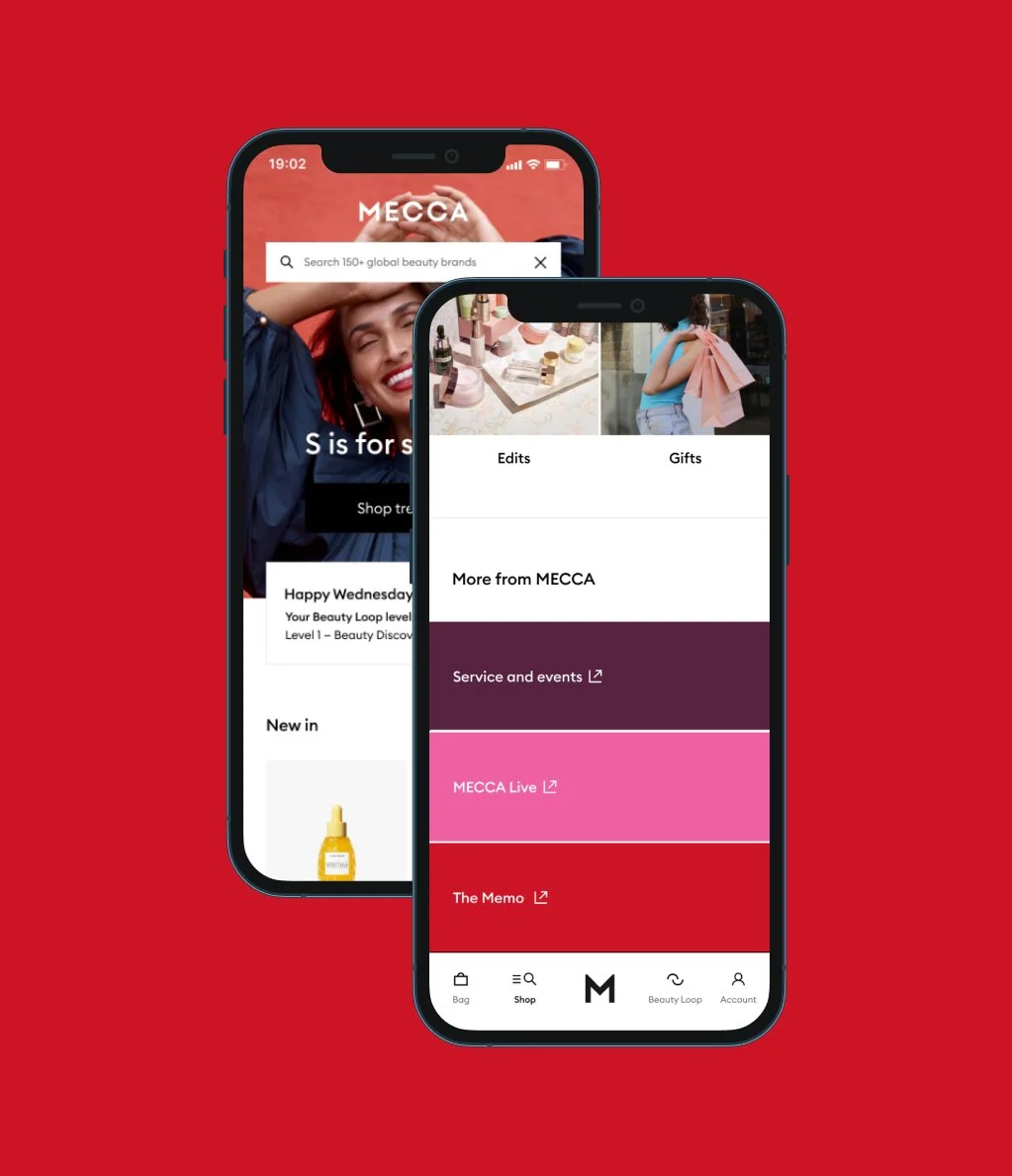
In 2019, I joined MECCA as a Design Manager to build a design function from the ground up. At that time, an external agency had been working on the MECCA Loyalty App. My task was to review the work that had been done and develop a plan to transition the work internally.
My Role
Stakeholder engagement
Setting direction for an app roadmap
Proposing new wireframes
Collaborating with a UI designer to establish the new UI
Prototyping and testing
Approach
The long-term plan was to have a MECCA cross-functional team work on the app. I began by reviewing the proposed page structure, UX, and UI, and worked with a product manager to map out a design roadmap. The goal was to launch a loyalty app for the initial release, then gradually introduce eCommerce functionalities.
Validation
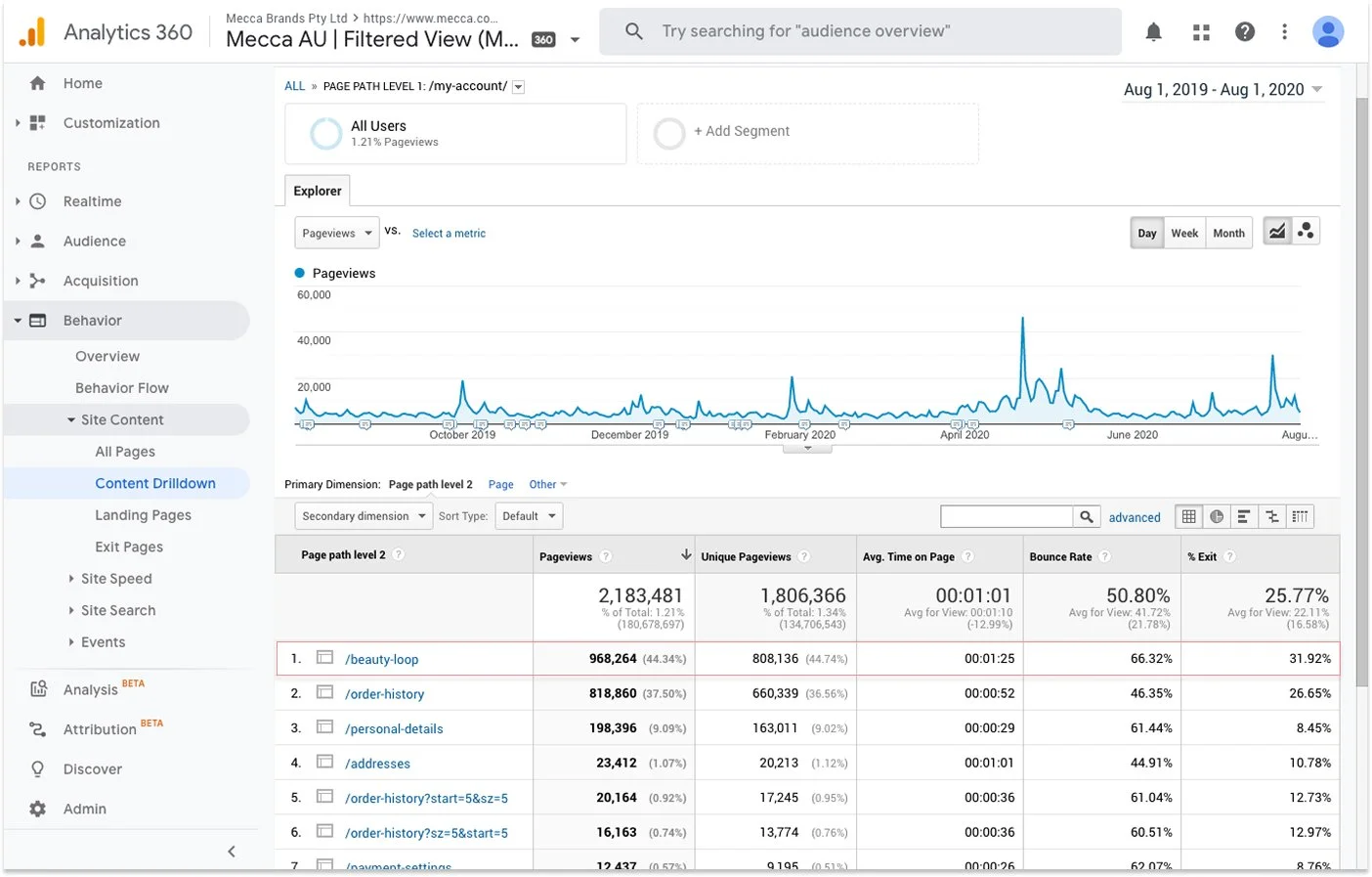
Analytics collected from the MECCA website indicated that 44.3% of visitors to the Account section accessed the Beauty Loop page. Store team members also confirmed that, on average, they had 3-4 customers per day asking to check their Beauty Loop level.
I cross-referenced quantitative and qualitative data to determine that, for the initial release, the two key functionalities for the app would be checking Beauty Loop levels and redeeming points by scanning the virtual card.
I built a prototype to validate key questions I had about the proposed design:
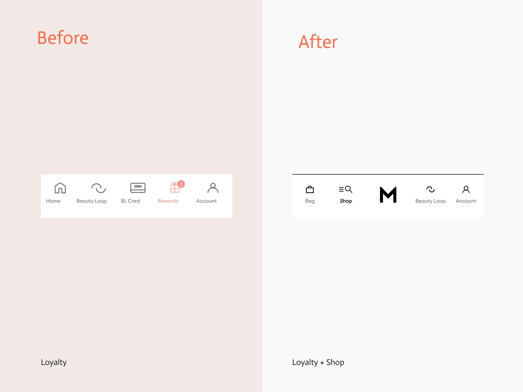
Does placing the Beauty Loop Card in the main menu as a separate item improve discoverability?
Is it necessary to have the level side swipe in conjunction with the navigational tabs?
Is 'Product' the correct terminology for the proposed shopping destination in the menu?
Guerrilla Testing
After interviewing 10 people in MECCA's Melbourne Central store, I synthesised the findings and made a design proposal with the app product team.
Users didn't have issues finding the Beauty Loop card under the Beauty Loop section, so the card was placed there.
'Shop' was deemed a better menu heading compared to the proposed 'Products'.
The tabs were redundant; most participants found the current level design overwhelming. The new design reflects the updated MECCA identity and streamlines the qualifying information to reduce cognitive load.

Impact
-
Preference testing with the Voice of Customer (VoC) program indicated that the new UI was preferred by 95% of our app users, showing that the rebrand had a positive impact.
-
This relatively small UX work helped spread the capabilities of the newly formed product design function and showcased evidence-based ways of working.
-
The app has maintained 4.9 out of 5 rating in the App Store


