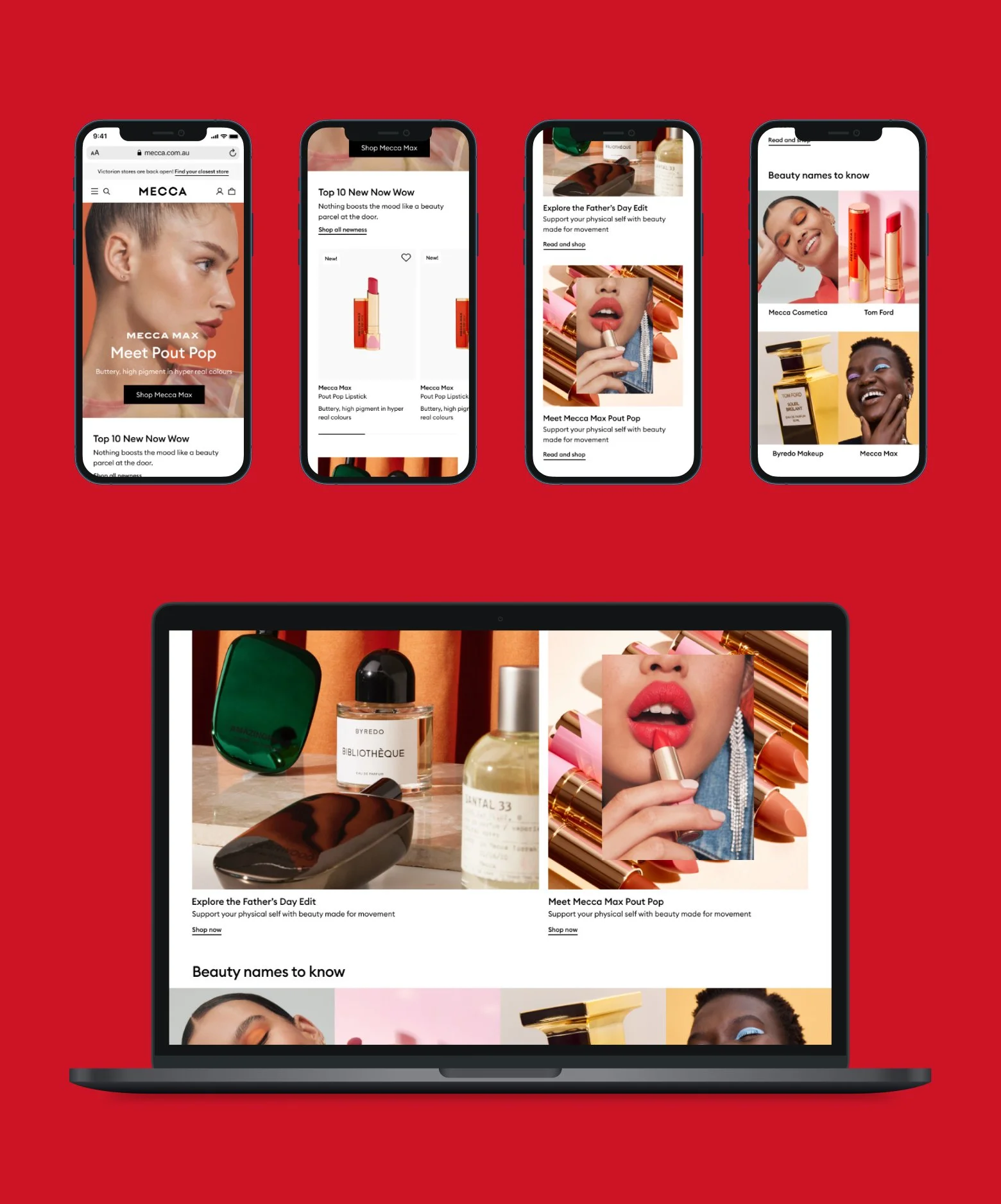
MECCA Ecommerce Website
Background
In 2021, MECCA embarked on a digital transformation journey to develop a new eCommerce site. The goal was to unify siloed systems and data, creating a seamless connection between the online and in-store experience. By establishing a 360-degree view of its customers, MECCA enabled teams to recognise customers at any point in their journey, delivering a best-in-class virtual shopping experience.
Experience Pillars Workshop
I led the product design team began the discovery process with a Design Vision workshop, bringing together the identity design team, marketing, and key stakeholders. This session helped establish a clear north star, defining the key attributes of the experience we wanted customers to have while engaging with the MECCA website.
Accessibility
Build comforting, engaging and exceptional experiences through accessible information & diverse voices.
Communities
Connect with close-knit communities to inspire, energise & encourage knowledge sharing.
Education
Become the ultimate source of truth grounding ourselves in kindness & generosity.
Expert
Build confidence in others by offering expert guidance at the relevant times in their journey.
Value
Create valuable experiences through deep emotional connection beyond transactions.
My Role
Planned the timeline, ensuring a smooth workflow.
Helped define the product roadmap by prioritising features and facilitating feasibility discussions
Reviewed design work when team members sought support.
Set up a showcase framework to share designs and gather stakeholder feedback.
Coordinated research timelines and validation plans with the Research Principal.
Managed stakeholders, facilitating alignment and decision-making.
Helped define a workflow with the Deloitte development team, guiding them in adopting an agile working model.
Presented progress updates to the business owner and gathered feedback.
Scheduled and planned accessibility check-ins and audits.
Collaborated with the internal data analysis team to plan tracking for experience requirements.
Led discussions on A/B testing and vendor selection.
Approach
A team of five product designers worked four weeks ahead of the development timeline, following the double-diamond process for design. The goal was to conduct light-touch validations when necessary and run multiple comprehensive end-to-end usability tests during the Beta or build phase.
I collaborated with the Head of Product to apply the KANO model for feature prioritisation and embedded feasibility checkpoints with the development team.
CMS Discovery
We worked with the content team during the discovery phase to understand the current content generation process, the parties involved, and the tools used to complete the tasks.
Journey maps were created for key areas of the site to highlight pain points and opportunities.
Through the process, we gained a deeper understanding of design feature needs from the internal business perspective.
Methodology
12 customers recruited through Askable and internal contacts
Mix of Mecca and non-Mecca customers
1 hour one-on-one interviews
Tasks on Sephora.com and Beautybay.com
Qualitative Research
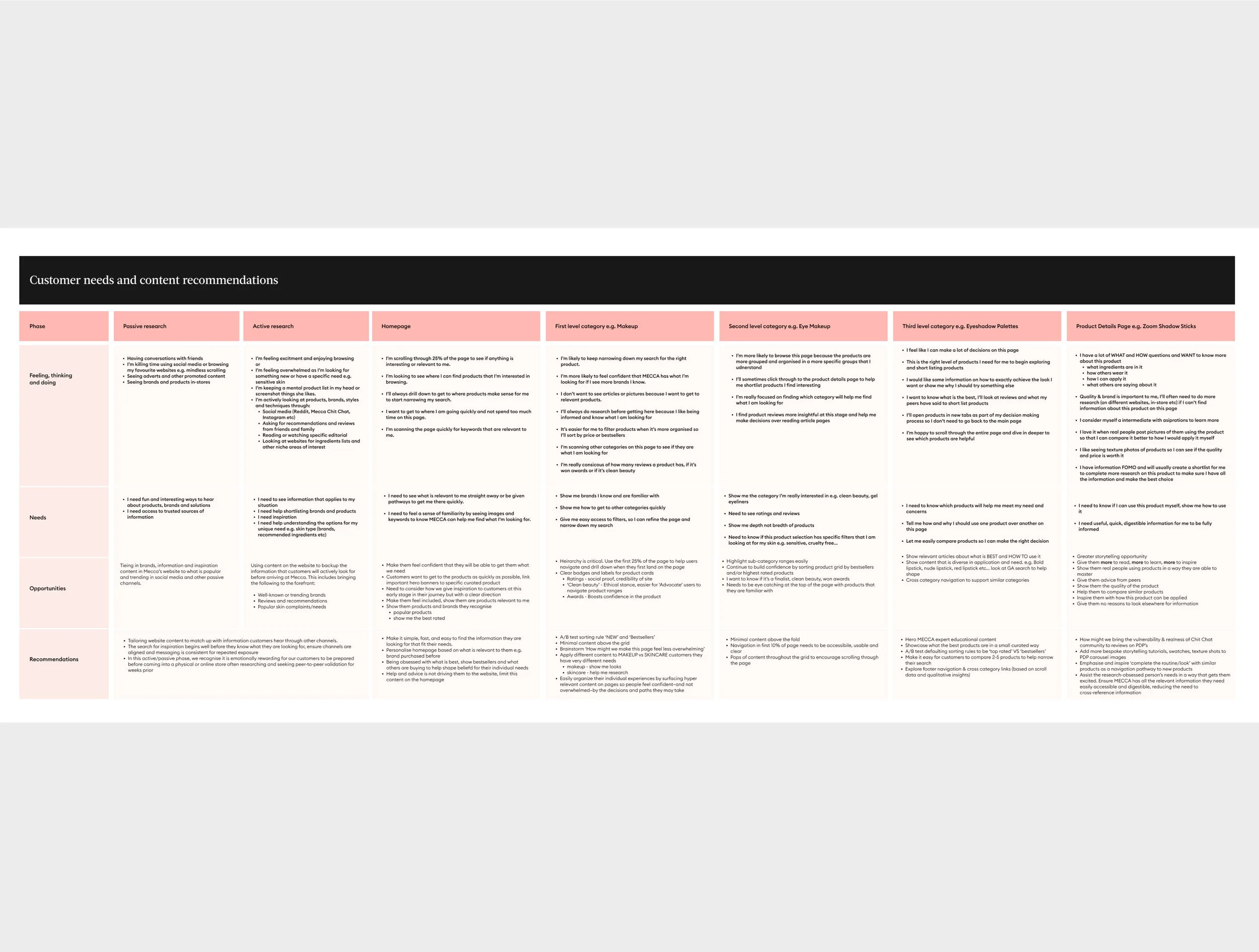
To gain a better understanding of how customers find inspiration, research brands, and discover products, the research was conducted to help guide, understand, and inform what type of content was required on various pages of the website.
The objectives were to design and create a content user flow that customers find helpful, engaging, and that meets their needs — ultimately leading to a purchase. We needed to find out the following information:
What steps do customers take to research?
What content is most useful, and at which point in their journey do they need it?
What motivates and inspires them?
What are the different shopping modes?
The customer interviews identified four different shopping modes. The findings became the key reference when designing for the CMS.
Focused Discovery
Open Discovery
Repeat Purchasing
Need it now
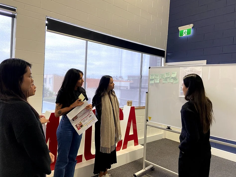
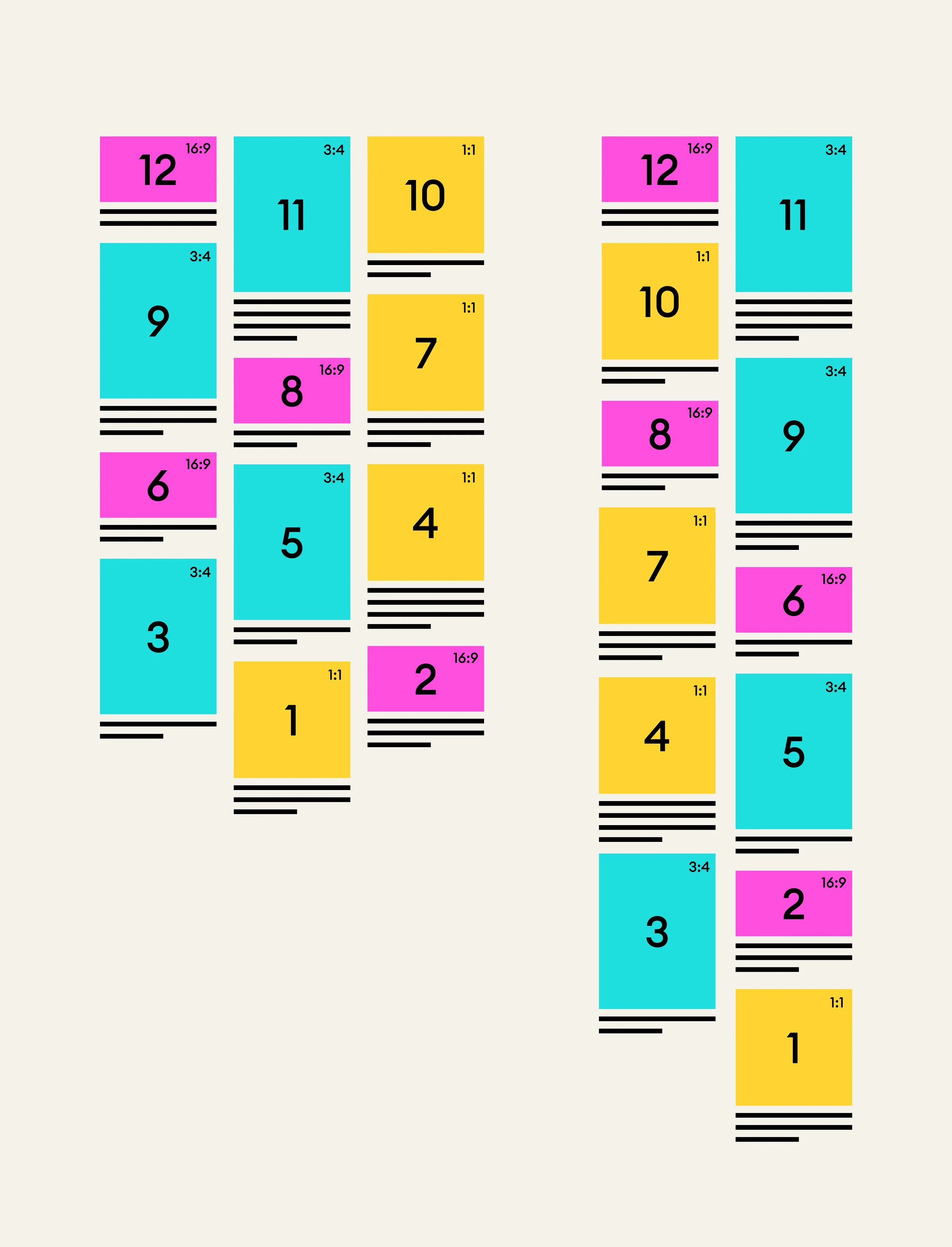
CMS Brainstorming Workshop
Checkout
As the key conversion point in the experience journey, the team worked within the constraints of the storefront reference architecture, customising the out-of-the-box experience to reduce friction, minimise build effort, and meet the delivery timeline.
Blog Posts
As the key conversion point in the experience journey, the team worked within the constraints of the storefront reference architecture, customising the out-of-the-box experience to reduce friction, minimise build effort, and meet the delivery timeline.
Pagination
Stakeholders strongly desired lazy loading as a feature. The hypothesis was that easing navigation between pages would increase add-to-cart actions and conversion rates.
After consulting with the Data Analyst and development team, we analysed existing app data (lazy loading) and compared it to the current website data (pagination). We proposed a solution that allowed users to view 46 products seamlessly without compromising site performance or accessibility requirements.
Through this approach, stakeholders gained a deeper understanding of the evidence-based design process and aligned with the proposed solution.
MEMO the Blog Design
Design System
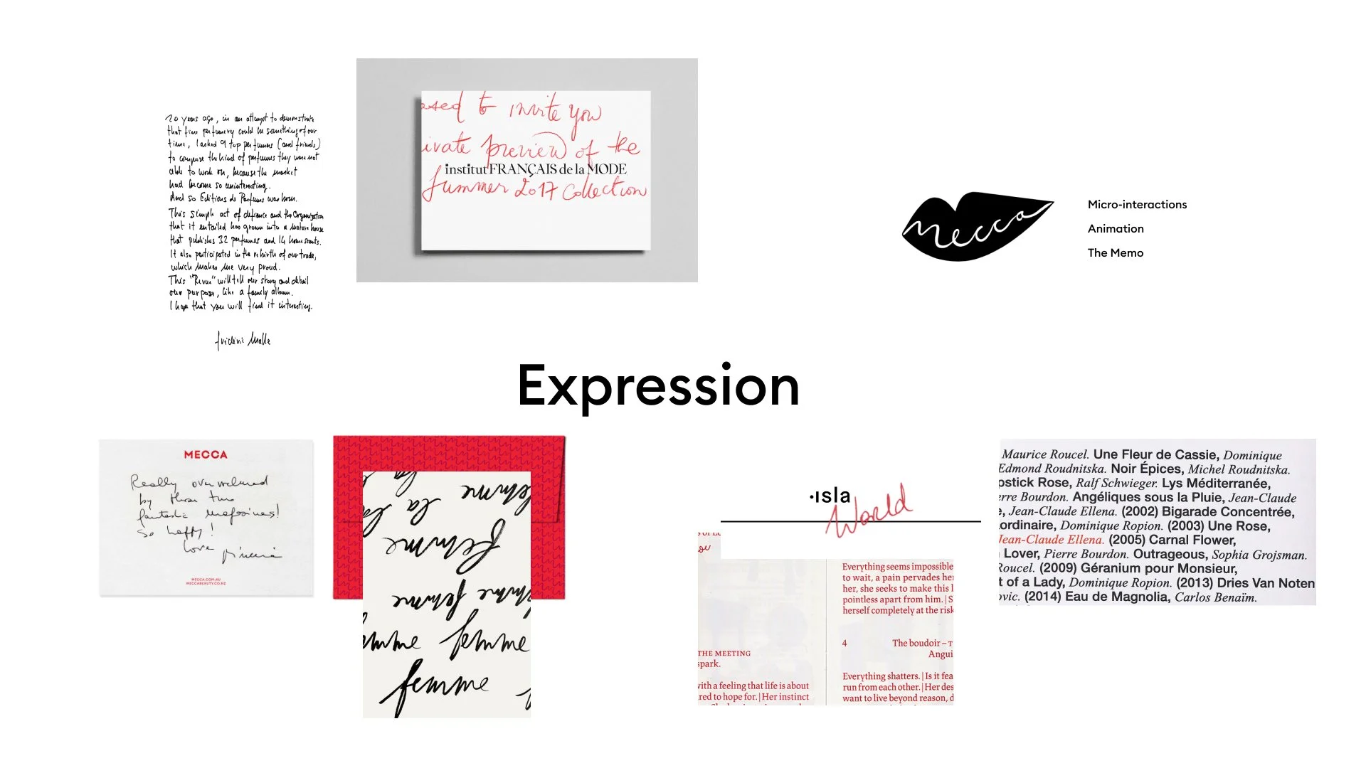
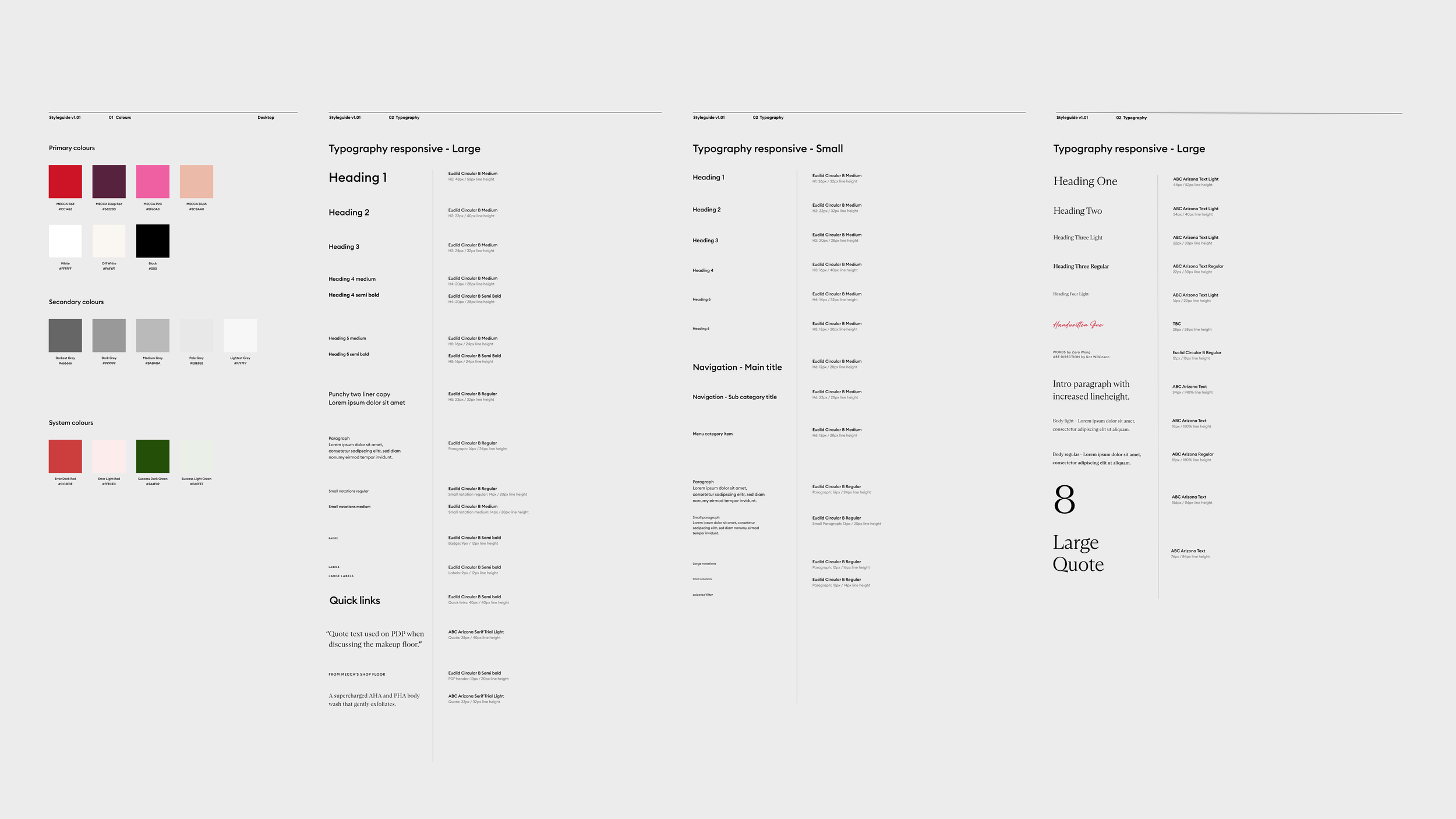
As part of the website redesign project, the product design team had an exciting opportunity to create a design system using the newly developed MECCA design elements from the brand identity team.
The project timeline was ambitious—we had two months to collaborate with the in-house identity design team to finalise a design vision: a digital style guide for the design system. At the same time, wireframing and website design were progressing at full speed.
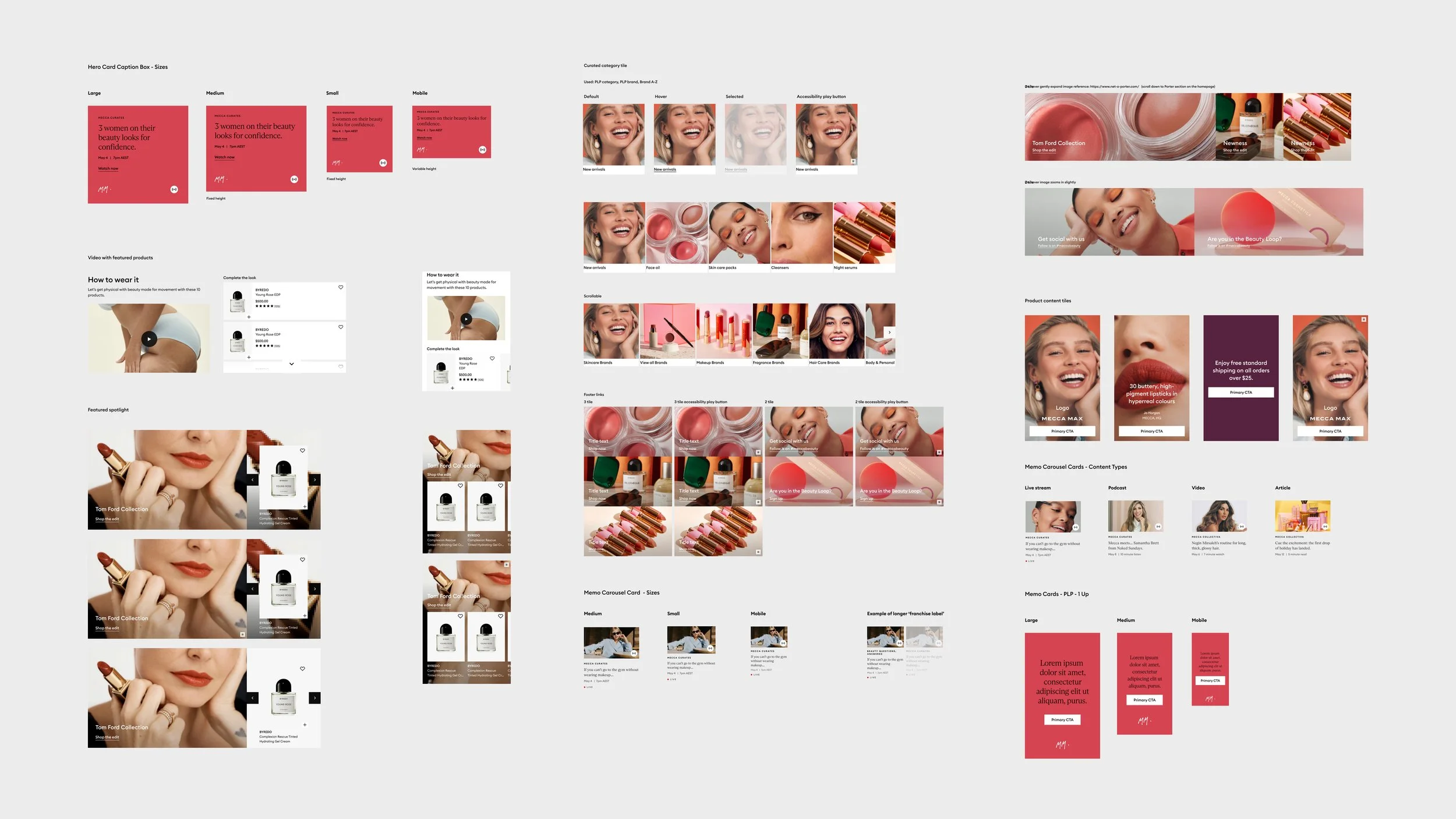
Component Library
Once the Design Vision received approval from stakeholders, the product design team used it to create a digital style guide and expand the component library. Polished UI was applied once a feature was ready.
Spacing Guideline
By applying one-directional spacing, the Principal UI Designer tested and defined a flexible set of rules for designers and developers to follow.
Breakpoint Analysis
Every screen size must be optimised for the best viewing experience. I conducted a breakpoint analysis by examining the device sizes and types most commonly used by our customers. I then shared the findings with the front-end development team to finalise the breakpoints.
Accessibility
As advocates for all users, the team ensured the design system was both beautiful and accessible. I onboarded an accessibility consultant to review the polished UI, adding design annotations to ensure our solution met accessibility commitments.
Results and Takeaways
-
Design Meeting the Estimated Timeline
The discovery and wireframe phases were completed in six weeks, and the team met the timeline by delivering the UI in the following four months. However, the build phase was delayed due to Deloitte's resourcing issues. The project is scheduled to launch in 2023.
-
Estimated 58% Time Savings on Content Creation
With the new CMS, the content team no longer relies on the development team to hard-code campaigns on the website.
-
Development Speed
30–40 reusable APIs were built with Mulesoft. With the new warehouse management system (WMS), inventory update time from is reduced form 24 hours to just 3 seconds.
-
It Takes Time to Form and Storm
When a new project team is forming, it’s important to account for the time and effort needed for people to meet in small groups, build trust, and collaborate through discussions.
-
Planning, Planning, Planning
Despite the tight timeline, the product design team adhered to its ways of working without compromising quality—thanks to rigorous planning.
-
Collaboration = Great Outcomes
We involved the development team early on to check feasibility. The product designers also worked closely together, sometimes jamming online to solve problems collaboratively. The result is a robust design system with lean, well-considered patterns.
