Myer CMS
Background
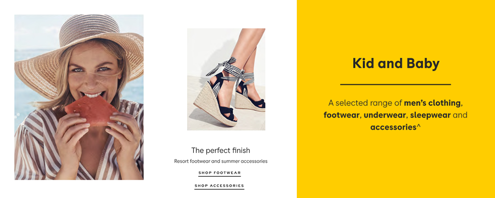
Campaign images and promotional messages online are Myer’s virtual window display. In 2018, Myer launched a new eCommerce website, and I was tasked with reviewing the initial CMS release, helping the product team define what success would look like for the next iteration.
My Role
Review the initial CMS design and identify gaps, including technological and experiential.
Work with the product manager to define OKRs for the CMS team.
End-to-end product design.
Lead interviews and workshops.
Stakeholder communication and management.
Conduct usability testing sessions.
Approach
I organised workshops for three groups of stakeholders—Sales, Buying, and the Content team—to gather feedback on the initial release. The goal was to understand their experience with the CMS so far, identify what is working well, and pinpoint areas for improvement. Additionally, we sought to understand what the ideal state of the CMS looks like to them.
We started the conversation with the following questions:
What do you think the customer needs/wants to see on the homepage of the Myer website?
In an ideal world, what would you want the Myer website to be?
What is working well with the initial CMS release?
What is not working with the initial CMS release?
What are your pain points with the CMS design/layout?
What does the homepage content we publish need to do to fulfil the needs of your area of business?
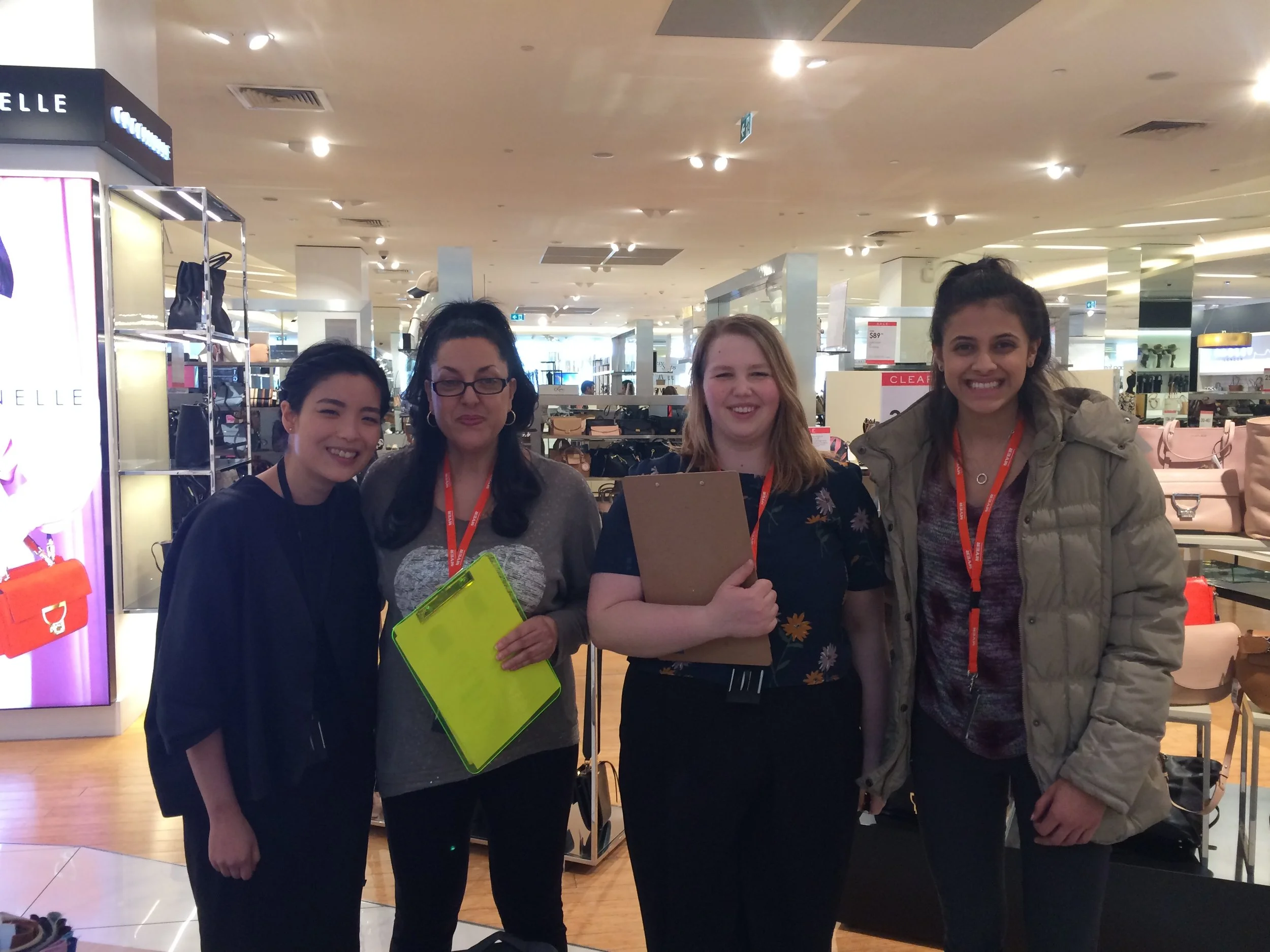
In-Store Qualitative Research
User Personas
Content Team
The external agency in charge of the art direction of photos and campaign messages, who also create and upload the design into the CMS.
Needs
Hero Newness
Elevate marketing and trade priorities
Nail and template sales
Inspire customers to increase their bag size
Myer Customers
Customers consume the messages intended by our Sales and Marketing teams. Through survey and user testing sessions, we have qualitative and quantitative data to form a view of what people want to see on the website.
Needs
Inspire
With product, price and through personalisation. Seeing messages/Sales that are relevant to me.Educate
Tell me something I didn’t already know. Deliver information exactly where and when I need it.Create Desire
With beautiful imagery and inspiring stories.
Analytics
It is difficult to decouple the success of the CMS design from the campaign messages, imagery, and offers. I worked with a data analyst to build a dashboard in Data Studio so we can gain clarity on:
Traffic flow through CMS tiles
Tile engagement at various points in the shopping experience
The intention is that through the accumulation of data, we can learn and fine-tune the placement of messages and their locations to reach the goal, showing the right message at the right time, which ultimately leads to an increase in conversions.
Journey Mapping and OKRs Workshop
I invited my team to be part of the discovery journey. Starting the workshop by sharing a draft of the current CMS workflow, pain points, and opportunities—information gathered prior to the workshop. The intention was to verify the information against my team’s understanding and add it to the journey map.
Then the product manager share a draft outline of the project goals. As the team had in-depth knowledge of the project and platform limitations, we wanted to collaboratively identify and prioritise OKRs. To give everyone opportunities to speak comfortably, we split people into small groups to think-pair-share their key results.
Objectives and Success Metrics
-
Increase product engagement via relevant placement of content
Measured
By 10% uplift in PDP views of the products featured in or related to content tiles
Potential Features
Shop the look inspiration content module. Homepage hero module. -
Increase campaign and offer engagement via relevant placement of content
Measured
10% uplift in the Campaign category page, Offer category and PDP views.Potential Features
Features we might focus on: Content tiles in Menu. -
Reduce time to create and manage content
Measured
Reducing content upload time by 20%. On average each tile should take under 8 minutes to upload, create and save.
Potential Features
Remove minatory fields and character limits. A message can be used on any tile spot.
Wireframing
With a clear view of the goals and success metrics in mind, I focused on creating wireframe concepts for the features identified by the team. This process allowed me to experiment with ideas without being too precious about the UI, address issues without technical restraints, and quickly gather feedback from the team and stakeholders.
Hero Banner
The hero banner is the prime real estate of the entire site. I aimed to create flexibility to highlight either a single strong message or multiple messages when the Sales team wants to drive sales across multiple categories.
-

Shop the Look Inspiration Module
Integrating commerce and content to offer inspiration and a quick pathway for customers to explore products.
-

Optimised CLPs
After reviewing the performance and analytics of current CLPs, recommendations were made to enhance their effectiveness:
1. Display category links on the left-hand side to improve navigation.
2. Ensure category landing page structures are flexible enough to accommodate different needs. For example, brand presence and new product launches are particularly important for the Beauty category.
-

Copy Guideline
Reviewing the site, I noticed inconsistencies in the tone and voice of the messaging. While working on the wireframes, I collaborated with a digital copywriter to establish clear guidelines for the content team.
The guidelines include instructions on writing copy when there is no CTA, defining each tile location, and recommending character lengths. They also cover contextual CTAs and strategies for crafting punchier body copy, allowing imagery to play a stronger role in storytelling.
Master File Concept
File Structure for Efficiency
Two key pain points that emerged from stakeholder interviews were CMS Flexibility and Efficiency.
When a content tile is added last minute, content publishers must resupply the entire row of promotional images in all responsive sizes. For example, adding a single tile to a row of two requires resizing and uploading a total of nine images for just one change.
I also analysed content across the site and mapped how often and where promotional messages appeared in campaigns. Using red post-it notes, I marked recurring messages, which aligned with insights from content publishers who frequently recreate the same promotional message for different locations and tile sizes.
Based on these findings, I proposed the idea of a Master File for each promotional message. I collaborated with developers to assess the feasibility and effort required to implement a master file structure. The concept ensures that once images and copy are supplied, the tile can be used in any CMS location without requiring manual image resizing.
Image Ratio
To achieve the Master File concept, all tiles across devices needed to follow a standardised set of ratios. I reviewed the initial tile designs and consolidated them into five key ratios: 4:3, 1:1, 2:3, 3:2, and 3:4.
By supplying images in these five specified ratios—along with the heading, body copy, and CTA entered in the master file—the promotional message can seamlessly roll out to any tile spot and function across all device sizes. This upfront consideration ensures a visually consistent, proportionally balanced tile system while significantly saving time for the content design team.
Responsive Design
Visual responsiveness is key to the tiles' aesthetics. In the initial release, font sizes were set for each breakpoint, causing the text to appear too large for the tile size at certain breakpoints.
To resolve this, I collaborated with the front-end developer to implement percentage-based typography, ensuring that both the font and images remain optimized across all screen sizes. This fluid type approach allows the text size to scale dynamically, maintaining a balanced and visually cohesive design.
Video Content
Understanding that video content is highly engaging and an effective tool for inspiration, I worked closely with our accessibility consultant throughout the project. Together, we developed guidelines for ambient videos, addressing aspects such as muted playback, restrictions on sudden movements and flashing lights, and creating a UI for pause and play functionality.
The accessibility consultant reviewed our stories before refinement sessions, ensuring compliance with accessibility standards and adding technical specifications within each story.
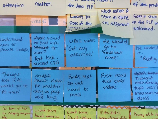
User testing was conducted on the video tiles with pause, play, and external video trigger functions to ensure the UI met user expectations and provided an intuitive experience.
“The master file structure is life-changing for my workflow.
— Ruby K, Content Manager
Future Iterations
Personalisation
Customer surveys revealed a growing demand for more relevant promotions and campaigns. We anticipate a homepage featuring personalised content and delivery status to enhance user experience. Personalised content can be incrementally tested and scaled up to measure its impact effectively.
Sales Template
To enhance seasonal campaigns and promotions, features like seasonal logo updates and background color changes on specific pages can add a festive touch to the site, creating a more engaging and dynamic shopping experience.
Results and Takeaways
-
OKRs Delivered
We successfully delivered all features outlined in our Q4 OKRs, along with a significant enhancement—the master file concept.
-
Campaign Performance Exceeded Targets
During the campaign period (Feb 24, 2019 – March 25, 2019), tile engagement reached 1.1M clicks, reflecting a 23.1% month-over-month increase, surpassing our team's 10% uplift target.
-
Increased Add to Bag Engagement
A total of 175.7K "Add to Bag" interactions occurred through content tiles, resulting in a 27.99% increase—again exceeding the 10% uplift goal set by the team.
-
Reduced Tile Upload Time
We delivered updates to remove mandatory fields and character limits. The master file concept significantly improved efficiency, reducing the average tile upload time from 8 minutes to 3 minutes per tile. Once a tile was created as a master tile, it could be deployed anywhere instantly.
-
Involve the Right People During Vendor Selection
With better planning and a clearer vision, we could have selected a CMS platform better suited to both business and customer needs. A key challenge in this project was the platform’s reliability, as requiring additional support from an external team delayed the delivery timeline.
-
Keep Stakeholders Informed
To ensure alignment, I conducted weekly walkthroughs and Q&A sessions with stakeholders and content publishers. These sessions covered upcoming releases and demonstrated how to configure tiles effectively. The feedback was overwhelmingly positive.


